


TL;DR
This blog showcases 43 epic design fails that highlight the consequences of poor design choices, from awkward typography to baffling branding mistakes. Each failure serves as a lesson in what to avoid when creating visual content. Learn how to steer clear of these blunders and ensure your designs effectively communicate your message without mishaps.
We’ve all seen it—whether it’s a poorly designed billboard with illegible fonts or a website that makes our eyes hurt, bad design is everywhere. And let’s face it, it’s not just a minor inconvenience.
Typography design fails, funny design fails, and even graphic design services that miss the mark can make or break a brand. A 2020 Adobe survey found that 38% of users will stop engaging with a website if the content or layout is unattractive. That’s more than a third of potential customers gone, all because of bad design!
At INKLUSIVE, we know that avoiding these pitfalls is key to creating designs that resonate. Whether it’s ensuring crisp typography or nailing the right graphic design layout, we are the masters of excellence. Ready to steer clear of funny typography mistakes and avoid bad typography examples? Let INKLUSIVE be your go-to design solution, making sure your brand stands out for all the right reasons.
This video from Ali-A features a hilarious collection of design fails that highlight just how wrong things can go when attention to detail is lacking.
Check out the video below for a good laugh at some of the most outrageous design mishaps:
World’s FUNNIEST Design Fails! (HOW!?)
This video would fit perfectly after “Section 3: 43 Epic Design Fails That Made Bad Design History” as it complements the hilarious examples of funny design fails discussed in that section. It provides a visual and entertaining break while staying relevant to the topic.
What Happens When Typography Goes Wrong

Typography is more than just a font selection—it’s about delivering a clear, engaging message. When typography fails, the effects are immediate and often damaging. Let’s break down how bad typography impacts your brand and user experience:
- Confusion: A poor font selection can confuse readers, making it hard to understand the message you’re trying to convey.
- Brand Credibility Loss: According to the Stanford Persuasive Technology Lab, 46.1% of people judge a website’s credibility based on its visual design, and typography plays a massive role in this. Worst fonts can make even the best content look unprofessional.
- Readability Issues: When fonts are too small, tightly spaced, or overly decorative, readability plummets, leading to user frustration.
- Customer Disengagement: If your typography is hard to read or visually jarring, people will simply stop engaging with your content. In a world where attention spans are short, this can cost you potential clients and business opportunities.
Key Examples of Typography Fails:
- Illegible Fonts: Overly stylized or “artsy” fonts might look cool, but they often compromise clarity, leaving readers confused or lost.
- Poor Letter Spacing: When the kerning (the space between letters) is too tight or too loose, it disrupts the visual flow of text and makes reading difficult.
Typography mistakes can seem small, but they make a big impact on how users perceive your brand. Don’t let bad design stand in the way of success. At INKLUSIVE, we specialize in creating clear, visually appealing designs that captivate audiences and avoid common typography traps.
Whether you need help refining your brand’s typography or a complete design overhaul, INKLUSIVE has the expertise to ensure your design communicates exactly what you intend.
Contact INKLUSIVE today to learn more and make sure your typography is working for you—not against you.
The Psychology Behind Design Fails

Design isn’t just about what looks good—it’s about how it makes people feel. Poor design, including bad typography, creates negative emotional responses, which can impact user behavior and brand loyalty. Here’s how design failures affect users psychologically:
- First Impressions Matter: According to HubSpot, 94% of first impressions are based on design. If your design looks unprofessional or cluttered, users will form an immediate negative opinion about your brand.
- Cognitive Overload: When a design is cluttered, confusing, or poorly executed, it overwhelms the brain. This cognitive overload causes mental fatigue, making users more likely to leave your website or abandon your content.
- Frustration and Anxiety: Bad design can trigger frustration. Imagine trying to navigate a website where the fonts are illegible, the layout is disorganized, and the visuals are overwhelming. Users often become stressed when they can’t easily find what they’re looking for, and this can lead them to leave your site and never return.
In today’s fast-paced digital world, every second counts. Users make snap judgments, and bad design can be a dealbreaker. Don’t let design failure push potential customers away.
INKLUSIVE understands the psychology behind good design and ensures every visual element aligns with user expectations, reducing cognitive load and creating positive first impressions.
If you’re ready to elevate your design and deliver a seamless user experience, get in touch with INKLUSIVE.
Let us help you avoid the pitfalls of bad design and create experiences that not only look good but also feel great for your users.
Design with INKLUSIVE43 Epic Design Fails That Made Bad Design History
Everyone loves a great design success story, but sometimes, it’s the epic fails that leave the longest impression—especially when they go viral. Whether it’s a bad font choice, a graphic gone wrong, or a funny typo, these 43 notable design disasters show how even the tiniest mistake can snowball into infamy. Get ready to cringe, laugh, and learn from these hilarious, and often shocking, design fails!
1. “Kids Exchange” Sign Fail
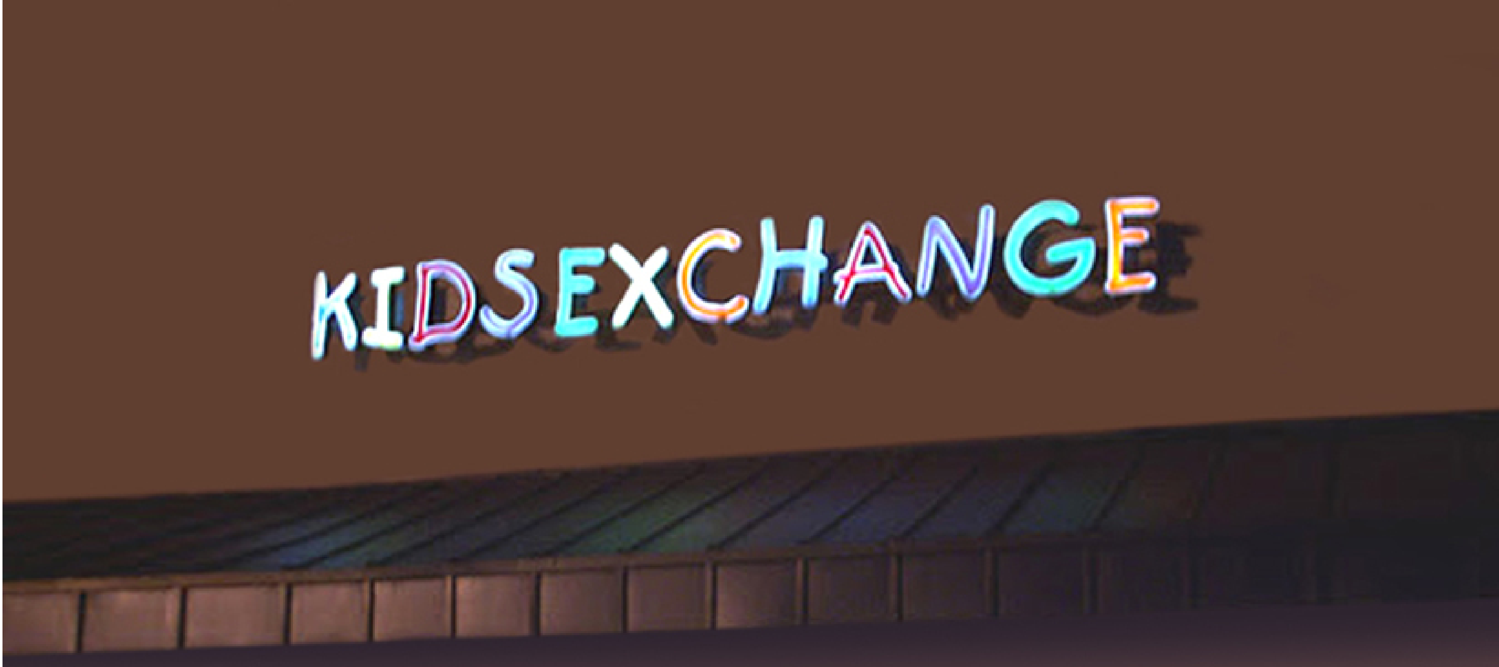
Imagine driving past a place called “Kids Exchange.” It’s meant to say “Kid’s Exchange,” but the lack of proper spacing turned it into a nightmare for anyone concerned with child safety. A simple fix—adding space or punctuation—could have saved this sign from becoming one of the most notorious typography mistakes ever.
2. “STOP” Sign in Comic Sans

Stop signs are meant to demand attention and provide clear instructions. However, when someone decided to use Comic Sans for a stop sign, the urgency was entirely lost. Comic Sans is infamous for its playful, casual look—not the right font to command authority.
3. The “Fail Whale” of Twitter
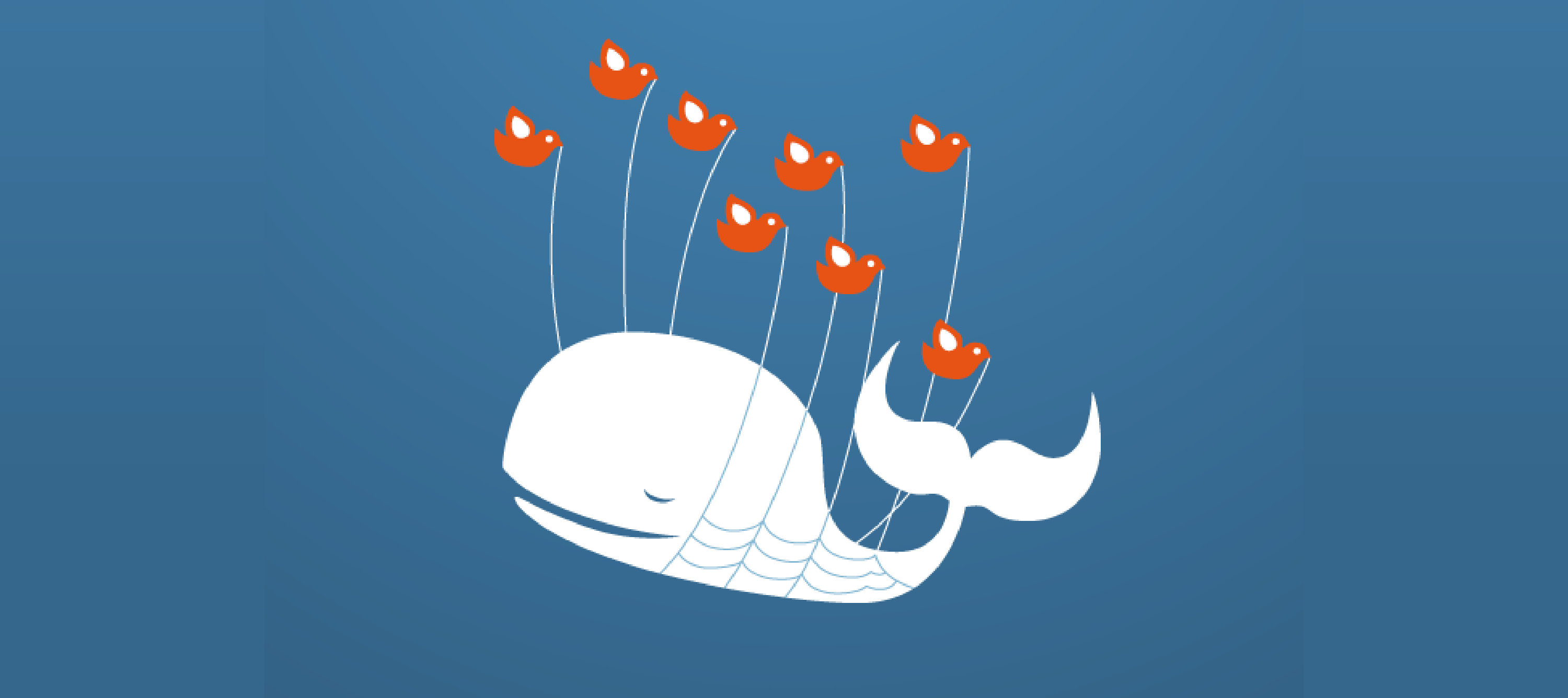
In the early days of Twitter, when the site would crash (which was often), users were greeted with the now-infamous “Fail Whale”—a whale being carried by a bunch of birds. The design was intended to be whimsical, but it quickly became a symbol of Twitter’s inability to stay online. Sometimes, even an aesthetically pleasing graphic design can be a failure if it highlights your weaknesses.
4. Gap’s Short-Lived Logo Redesign

In 2010, Gap decided to update its classic logo. The new design—a sans-serif font with a small blue gradient box—was met with immediate backlash. Customers hated it so much that Gap reverted to its original logo within just six days. This is a classic case of a brand trying to modernize but losing sight of what made its design iconic in the first place.
5. Olympic Logo 2012: A Controversial Design
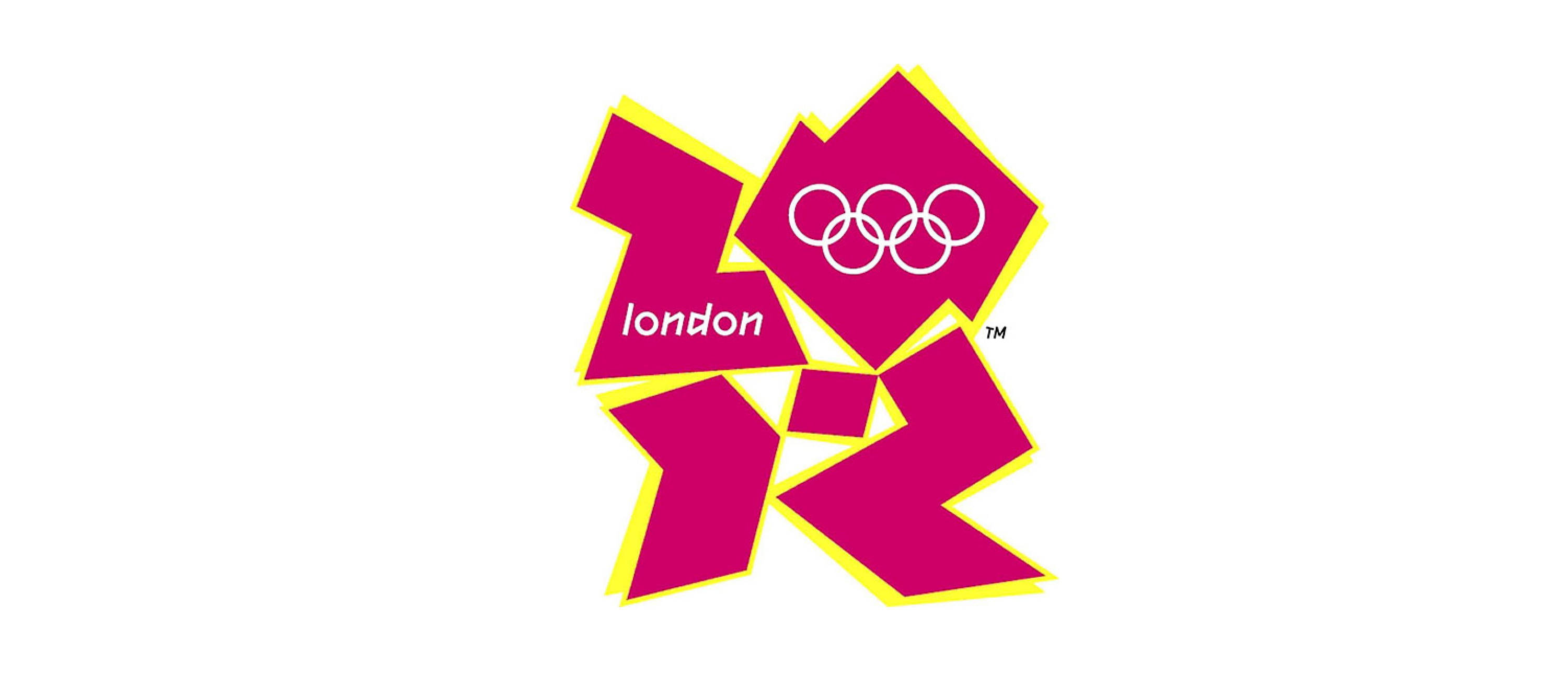
The 2012 Olympic logo, designed to be edgy and youthful, turned into a laughingstock worldwide. Many said it looked like a jumble of shapes or even a misinterpreted swastika. With its sharp angles and unconventional layout, it failed to connect with the public and became one of the most controversial logos in Olympic history.
6. London Underground’s “Mind the Gap” Typo
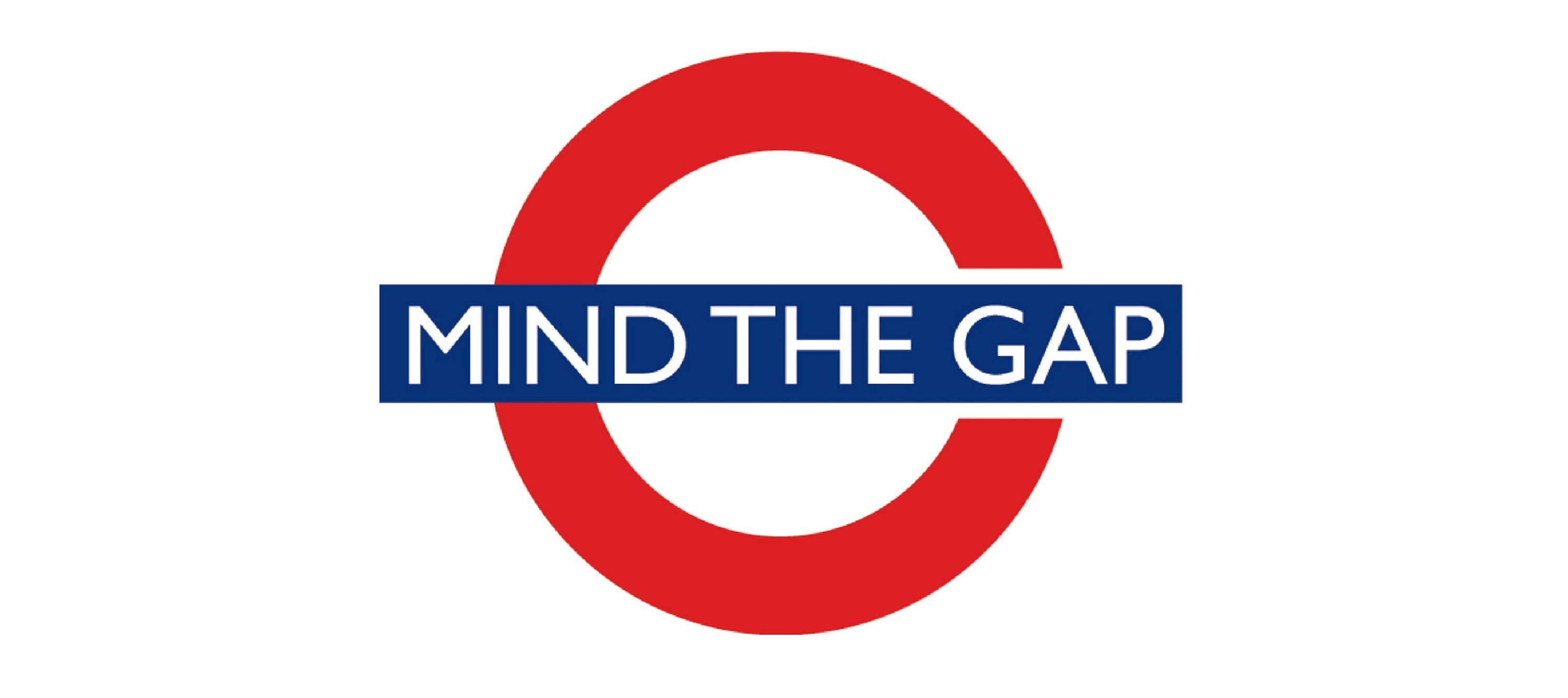
The phrase “Mind the Gap” is iconic for London’s public transport, but during a redesign, a typo appeared on signage that said “Mind The Cap” instead. The internet, predictably, had a field day. This small typography failure was enough to throw commuters into confusion and became a source of mockery for years to come.
7. “Megaflicks” Sign: It’s All About Spacing
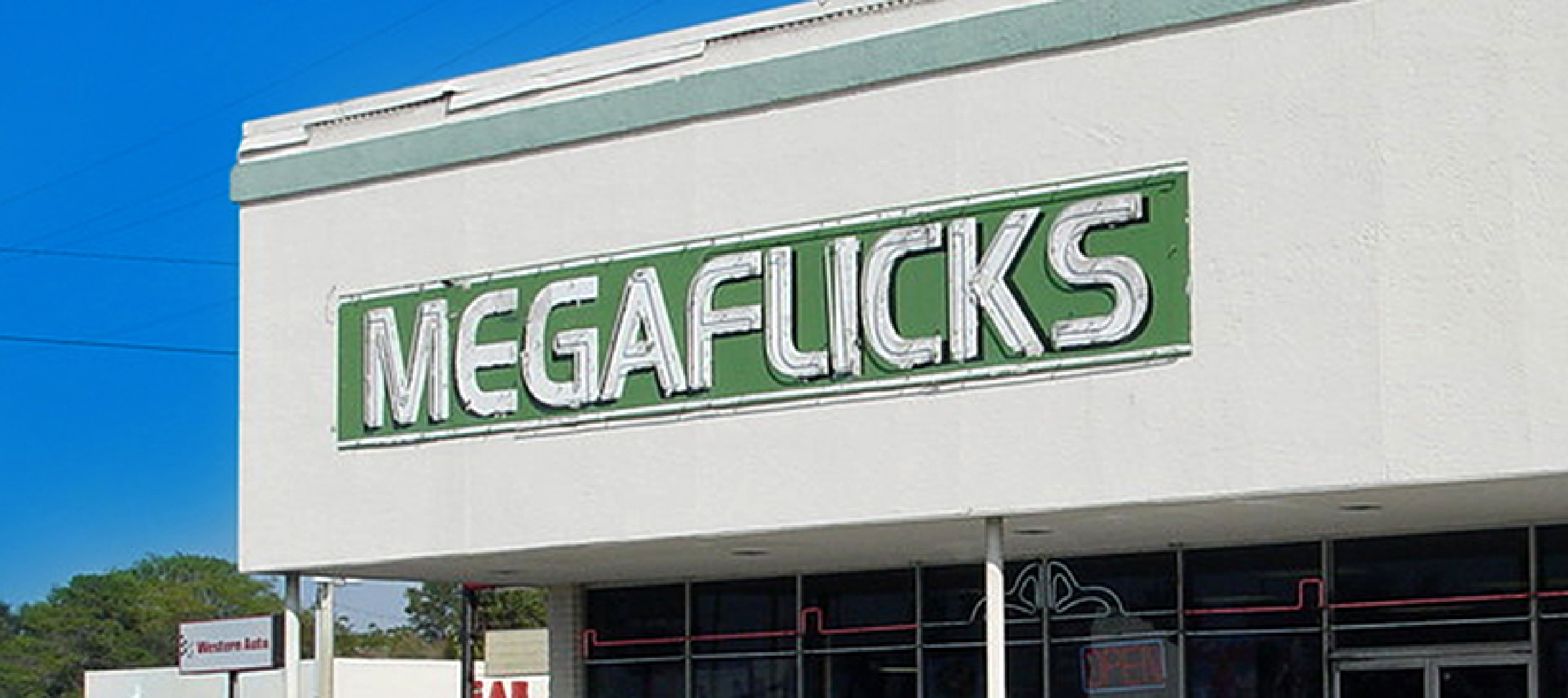
Megaflicks was a video rental chain. Their unfortunate choice of font and lack of proper letter spacing made it easy for passersby to read the sign as “Mega F**ks.” It’s a reminder that a small design oversight—like ignoring kerning—can lead to huge misunderstandings.
8. Hershey’s Chocolate Kiss Redesign
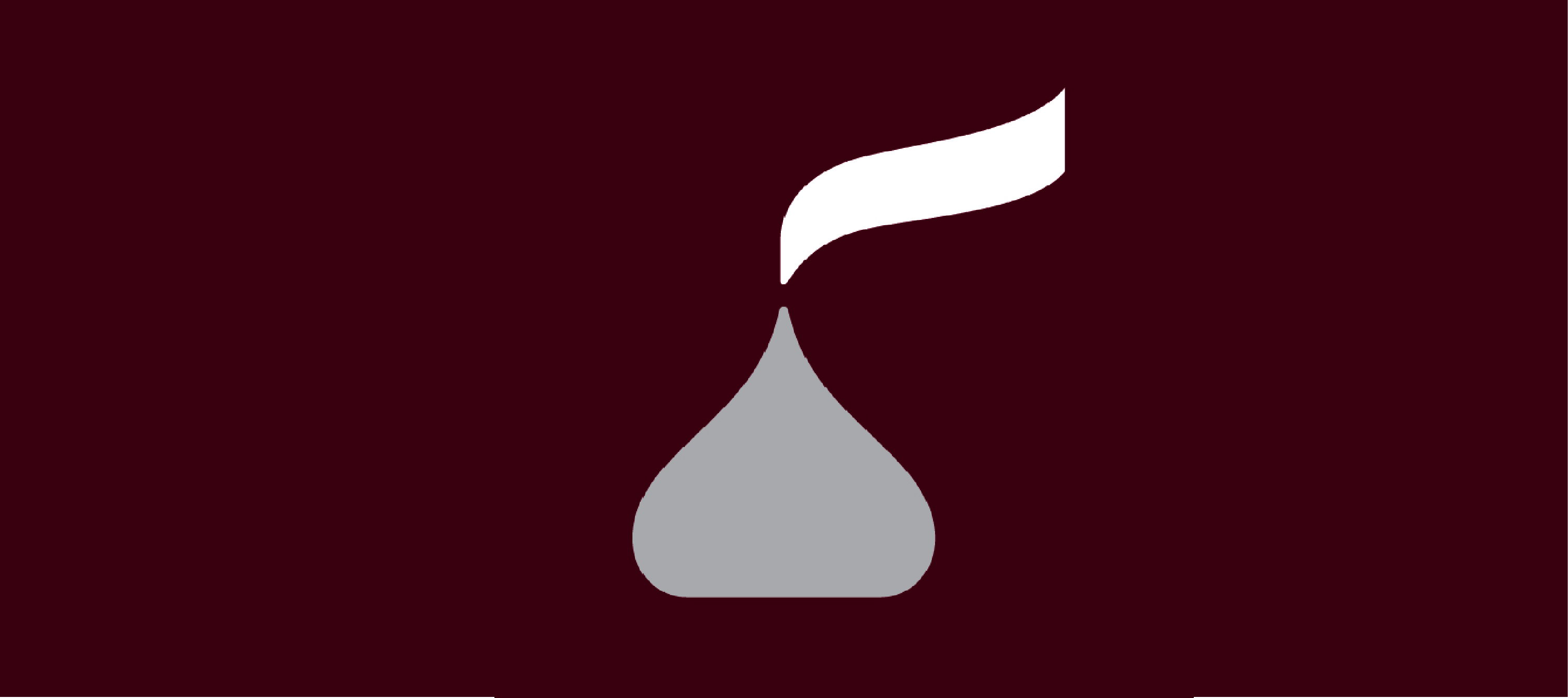
Hershey’s tried to give its iconic chocolate Kiss packaging a new look in 2014, but it turned out to be too minimalist. Instead of enhancing brand appeal, the new design looked more like a brown Hershey’s toilet, which left many scratching their heads—and laughing.
9. “Starbucks Coffee” Logo with Extra Letters
In a printing error, a batch of Starbucks cups came out with the logo misspelling “Starbucks Coffee” as “Starbucks Coffee.” While it was a minor mistake, customers laughed it, and it serves as a reminder that even big brands can fall prey to small but noticeable design failures.
10. A1 Steak Sauce vs. A1 Floor Cleaner
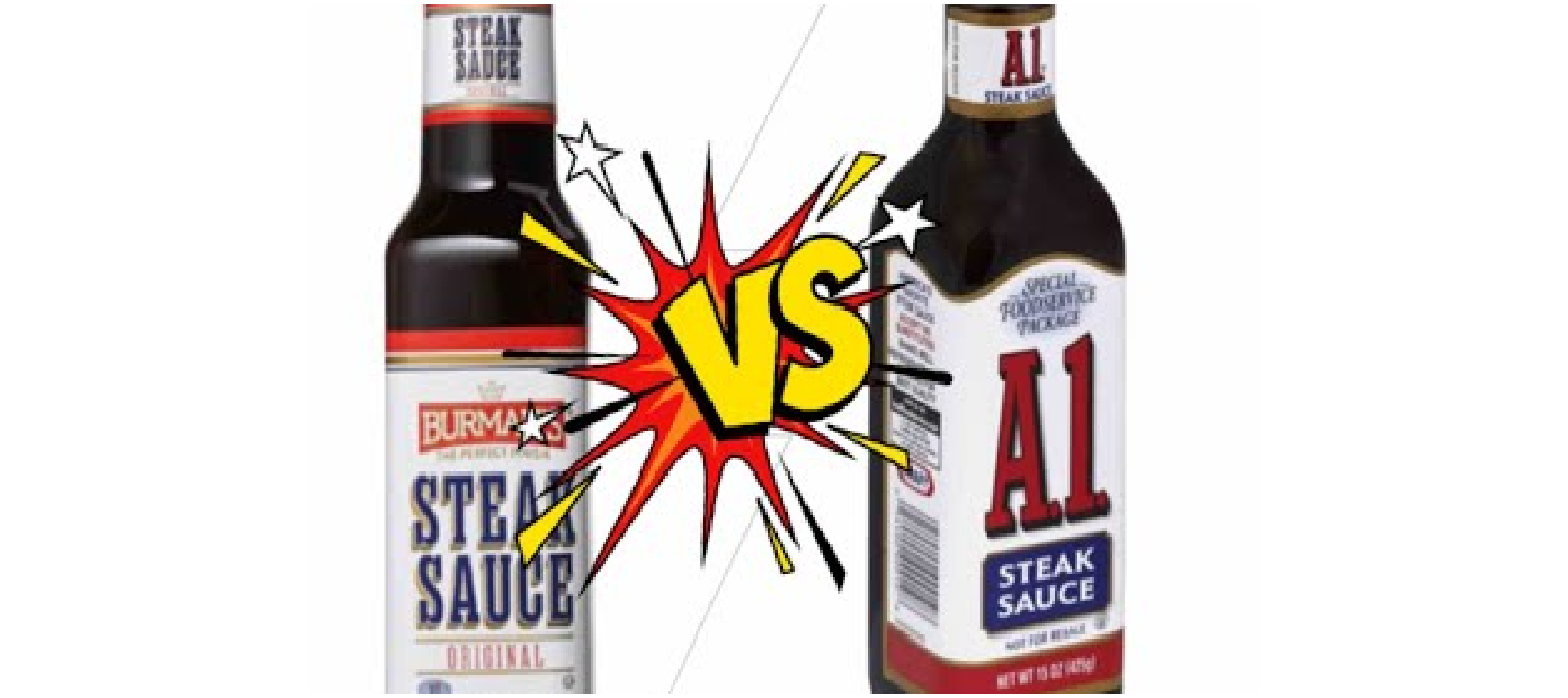
In one of the funniest product packaging fails A1 Steak Sauce was almost indistinguishable from A1 Floor Cleaner due to identical label designs. This confusion caused several customers to mistake one for the other—imagine cooking with floor cleaner! A simple color differentiation could have saved the day.
11. Double-Meaning Billboard: “We Sell Chairs!”
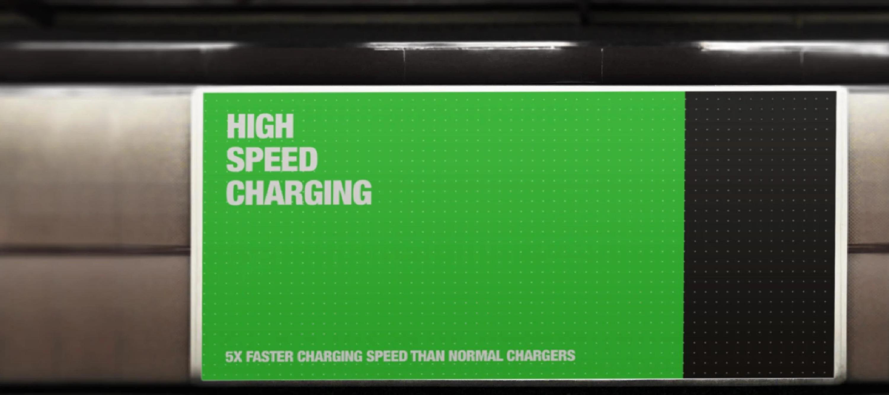
A poorly designed billboard for a furniture store once proclaimed, “We Sell Chairs!” But because the font was too large for the space, it cut off at an awkward place, reading, “We Sell Hairs!” This is a classic funny example of how improper scaling and layout can completely distort your message.
12. The Mysterious Floating Text

In a TV advertisement for a local car dealership, there was a scene showing a car driving down the road. However, floating in the sky above was a typo in the giant text that read, “Best Prices in Town!” Apparently, no one noticed this hilarious placement before it went live, causing viewers to focus more on the awkward skywriting than the actual car.
13. The “Nothing Else Mattress” Fail
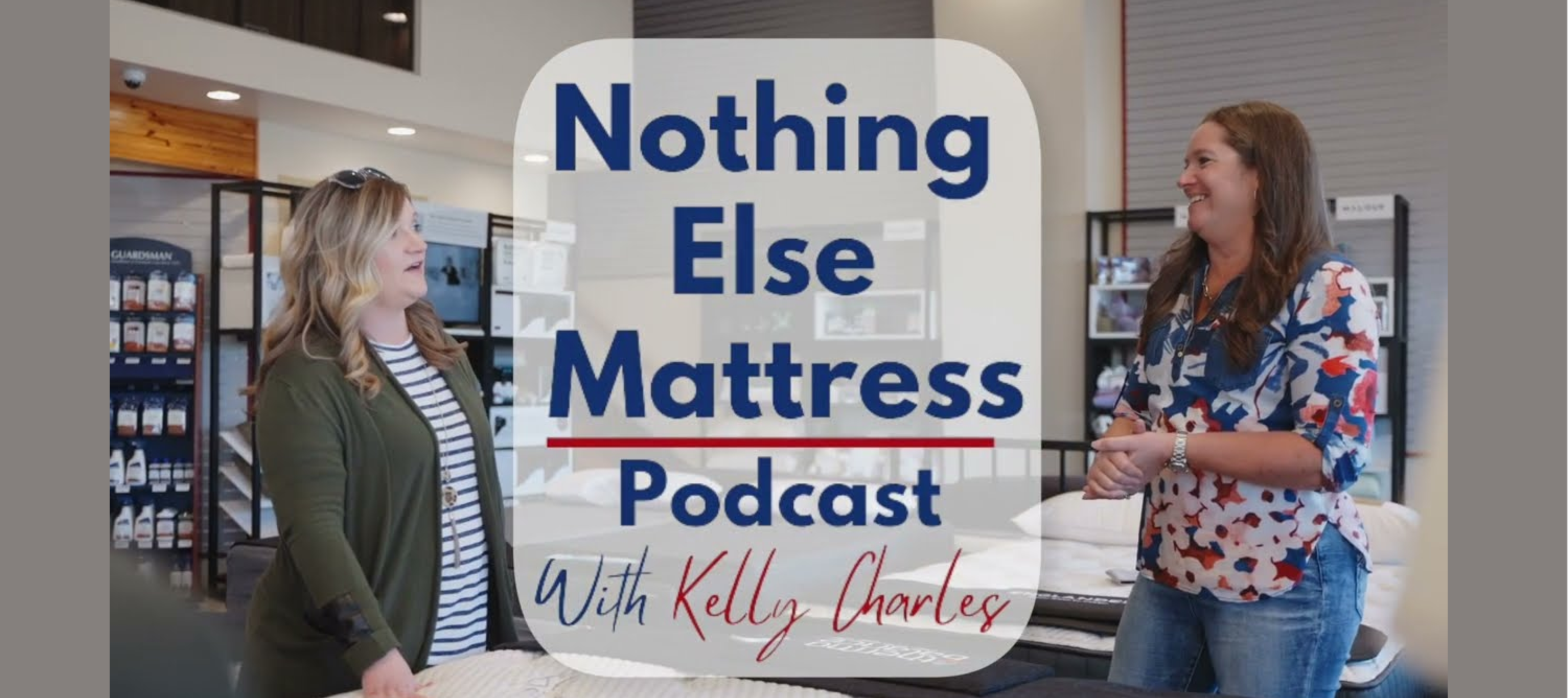
A mattress store ran an ad with a slogan that was supposed to say, “You’ll never need anything else.” Unfortunately, the poor font choice made it look like “You’ll never need anything,” leading to an unintended existential crisis for anyone reading the ad. Choose your fonts carefully, folks!
14. McDonald’s Healthy Food Campaign Backfire

McDonald’s once ran a campaign to promote its healthy food options, but the design team mistakenly placed a picture of a cheeseburger next to the words “Try our healthy salads!” The visual contradiction was so blatant that it led to widespread mockery on social media.
15. L.A. Dodgers’ “Champions of Baseball” Banner
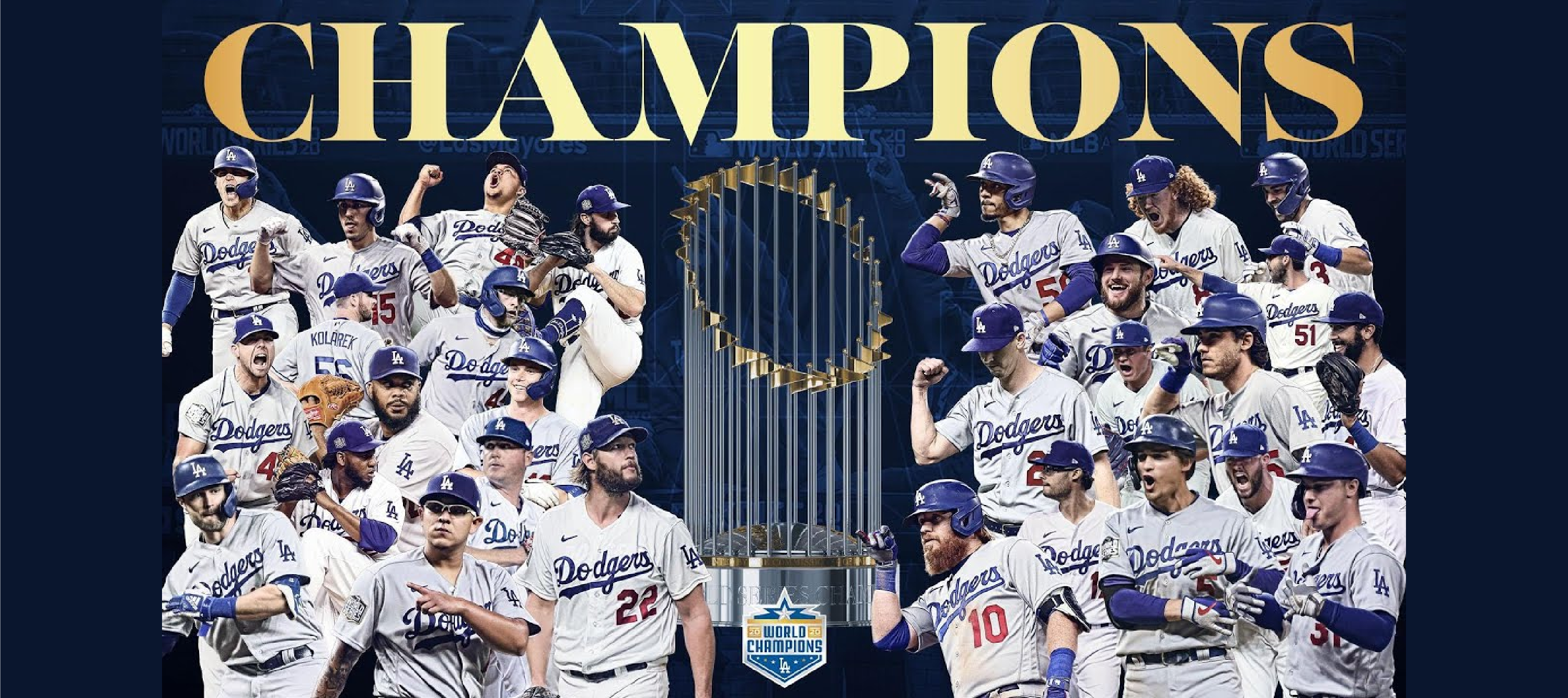
The L.A. Dodgers were excited to celebrate their victory as champions—except someone forgot to proofread their banner. The sign read, “Champions of Baseboll.” The typo overshadowed their win, and photos of the embarrassing moment quickly spread online.
16. NASA’s $125 Million Metric Fail

NASA is no stranger to space innovation, but in one notorious design fail, the Mars Climate Orbiter was destroyed because one team used metric units while another used imperial. This $125 million mistake was a stark reminder that even the smallest design oversight can have colossal consequences.
17. Nutella’s Brand Font Gets a Sticky Reputation

Nutella, the popular hazelnut spread, is known for its bold red-and-white logo. However, in one promotional campaign, the brand experimented with a new font that looked too much like Comic Sans. Fans were outraged, and Nutella quickly switched back to its original design.
18. The Reversible Hotel Shower Signs
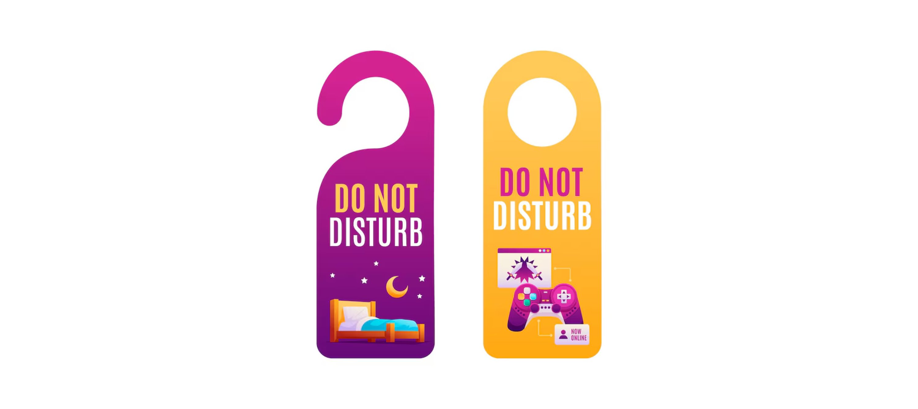
A hotel tried to be clever by printing reversible signs for their showers. One side said, “Hot,” while the other said, “Cold.” Unfortunately, guests found that the words could be accidentally flipped, leading to widespread confusion and a lot of cold showers.
19. “Best Kids Ever” Christmas Ornament
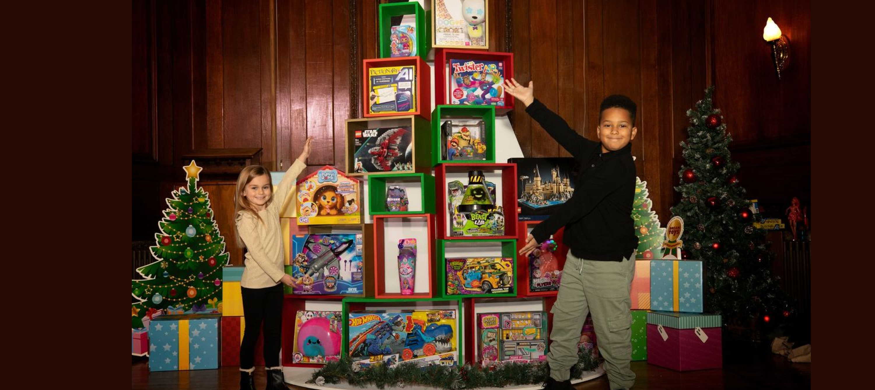
One memorable design fail involved a Christmas ornament that was supposed to read, “Best Kids Ever.” But thanks to inappropriate font choice, pairing fonts, and cramped spacing, it looked like “Best Kids Eveer.” It went viral, and the company had to reissue the product after receiving complaints from parents.
20. “Fish & Chips” Neon Sign Fail
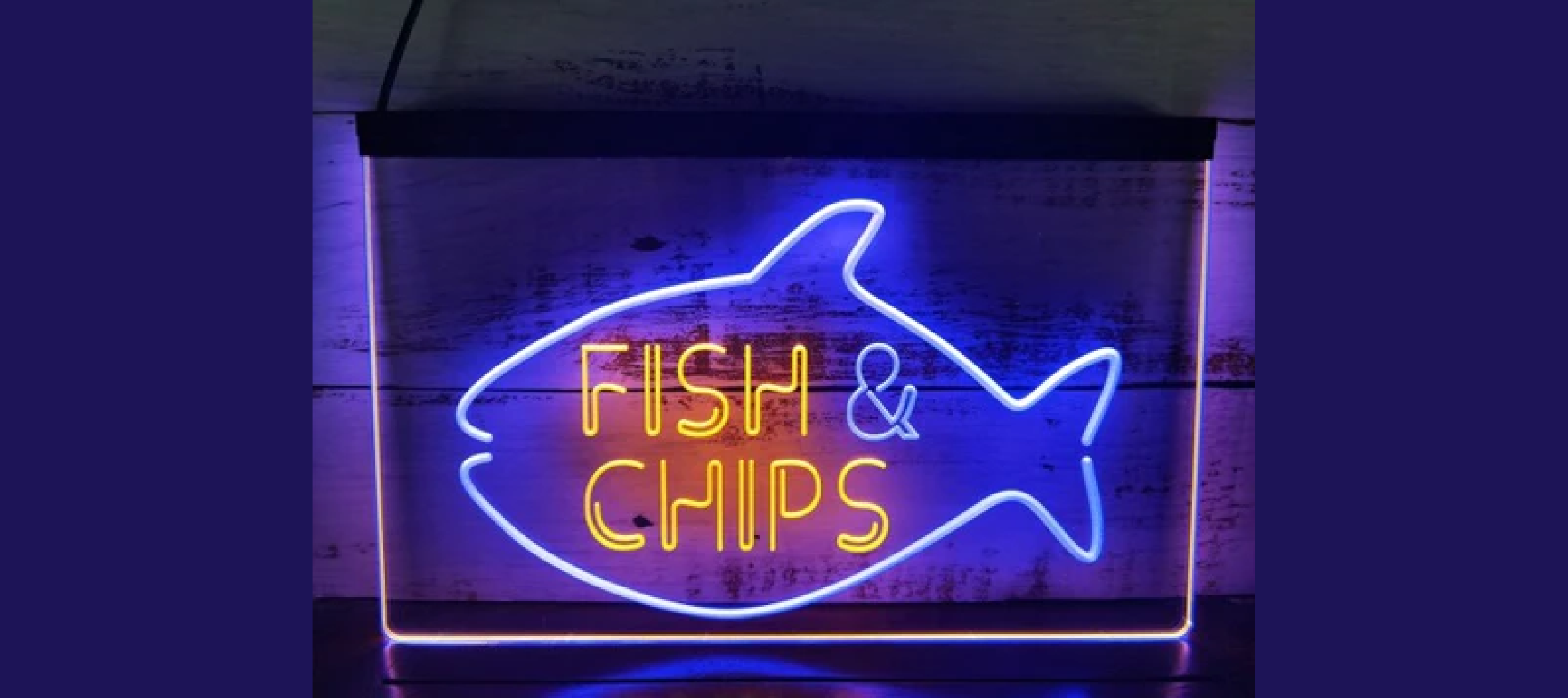
In one instance, a neon sign that was supposed to say “Fish & Chips” malfunctioned, causing only the letters “F” and “i” to light up. It became a viral sensation on social media, and the restaurant embraced the humor by keeping the sign as-is for a few days.
21. “Welcome” Mat with a Twist
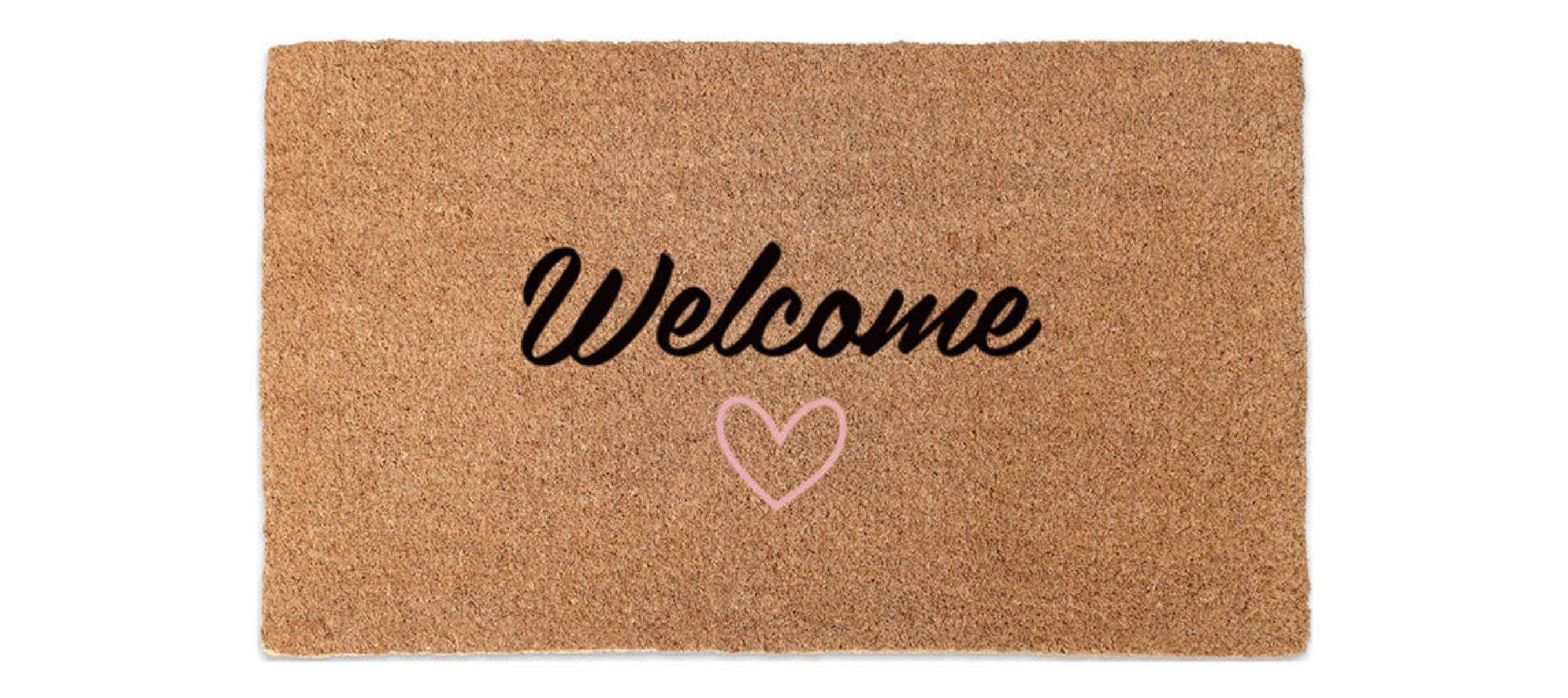
A company producing doormats once sent out a batch where the word “Welcome” was spelled backward. Customers who bought the mat as a joke ended up sharing pictures online, turning the company’s embarrassing oversight into a viral moment.
22. The Laughable Lottery Ball Mix-Up
In a televised lottery drawing, the numbers on the balls were printed in such a confusing font that viewers couldn’t tell if they were looking at 6s or 9s. The outrage led to a reprint of the lottery balls, but not before the fiasco was shared widely online.
23. Ikea’s Questionable “Effektiv” Collection
Ikea’s Scandinavian designs are usually a hit, but when they introduced the “Effektiv” collection, the name choice raised some eyebrows. In several languages, it sounded suspiciously like a curse word, leading to an unintentional laugh from customers around the globe.
24. The Pizza Hut Confusing Slogan Mishap

Pizza Hut once printed boxes with the slogan “Hot & Ready,” but the unfortunate placement of the text near the pizza picture made it look like “Not Ready.” This small mistake caused confusion among customers, leading many to post their bewilderment on social media, asking if their pizzas were ready or not.
25. “Please Press Button for Fish” Crosswalk Sign
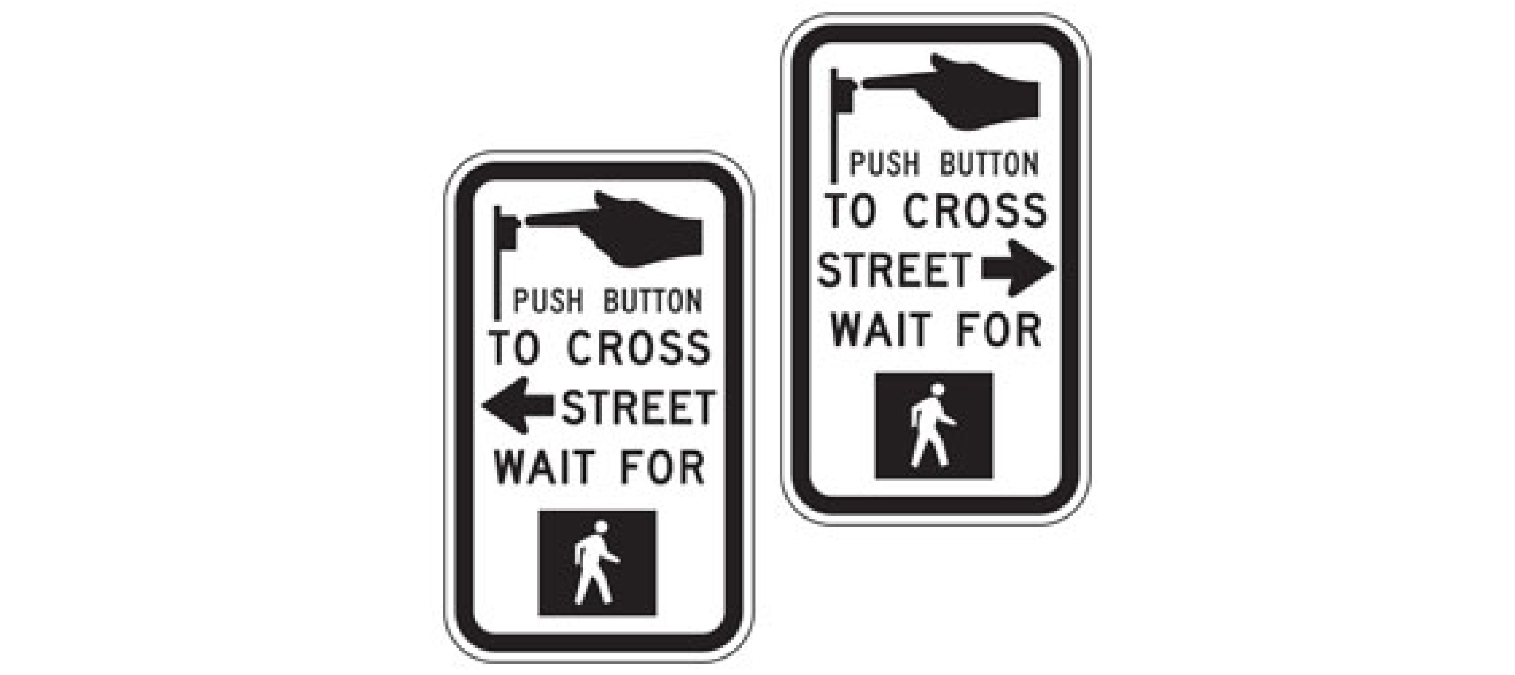
In a bizarre design fail, a crosswalk button in a coastal town read “Please Press Button for Fish” instead of “Press Button for Crosswalk.” Though this error was likely a mix-up in signage during installation, it turned a routine task into an unexpected punchline, with many pedestrians hoping for a fish delivery every time they pressed the button.
26. Pepsi’s Emoji Packaging Fail
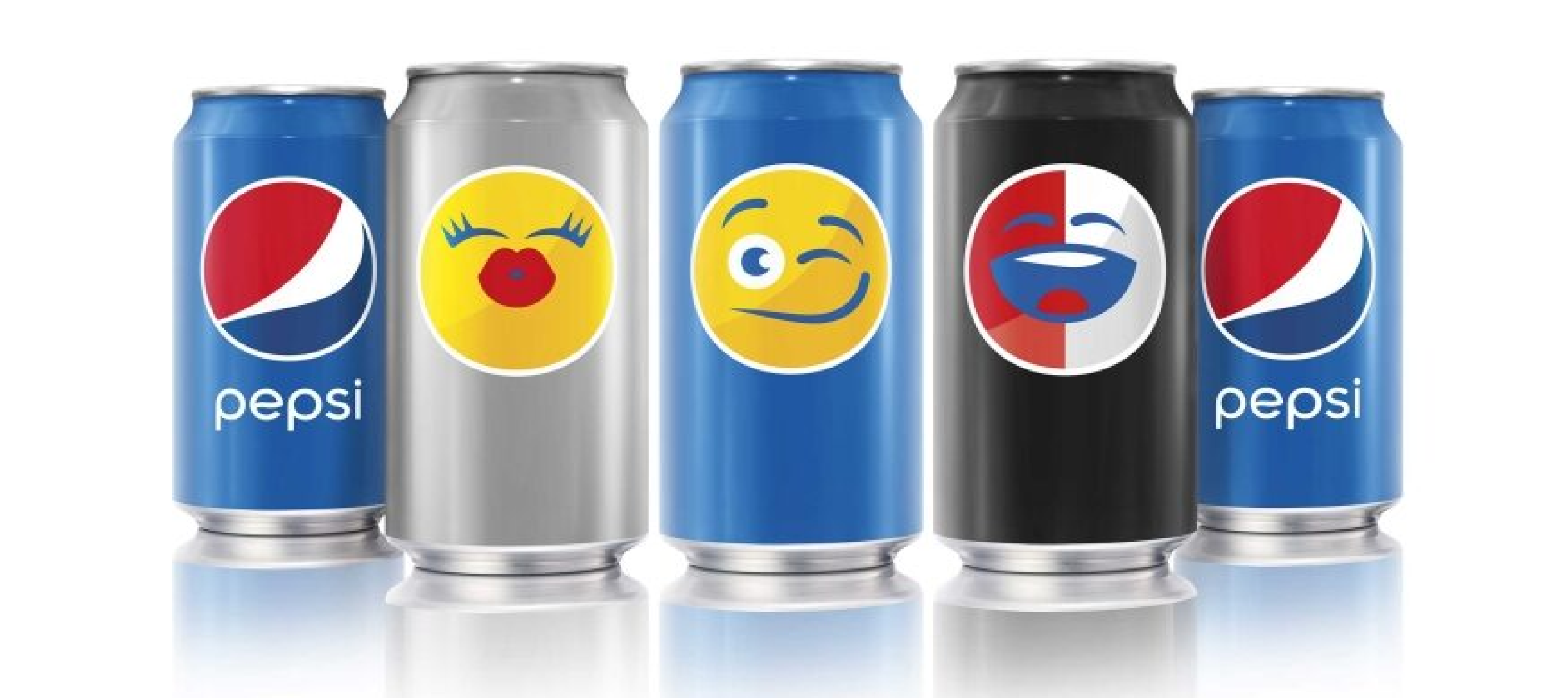
Pepsi thought they were onto something with their emoji-themed packaging, but one emoji in particular—depicting a smiley face with its tongue sticking out—was placed near the slogan “Say It with Pepsi.” The design led to unfortunate interpretations, with many seeing it as a mockery rather than a fun marketing idea. This is a perfect funny example of how unintended messaging can backfire.
27. “Barista Gives Free Coffe” Typo
In an otherwise well-crafted marketing sign outside a coffee shop, a simple typo turned the word “Coffee” into “Coffe.” While not the worst typo in the world, it’s a reminder of how tiny errors can undermine the professionalism of a business, and once again, social media was quick to notice the mistake.
28. Tropicana’s Packaging Redesign Failure

Tropicana underwent a brand refresh in 2009, replacing its iconic logo and orange-with-straw image with a generic-looking design that confused and alienated consumers. Sales plummeted by 20% within two months, costing the company $30 million in losses [source: NY Times]. They quickly reverted to the old packaging, but the lesson was clear: sometimes, classic designs are best left untouched.
29. “Turn Left at Next Wrong Turn” Road Sign
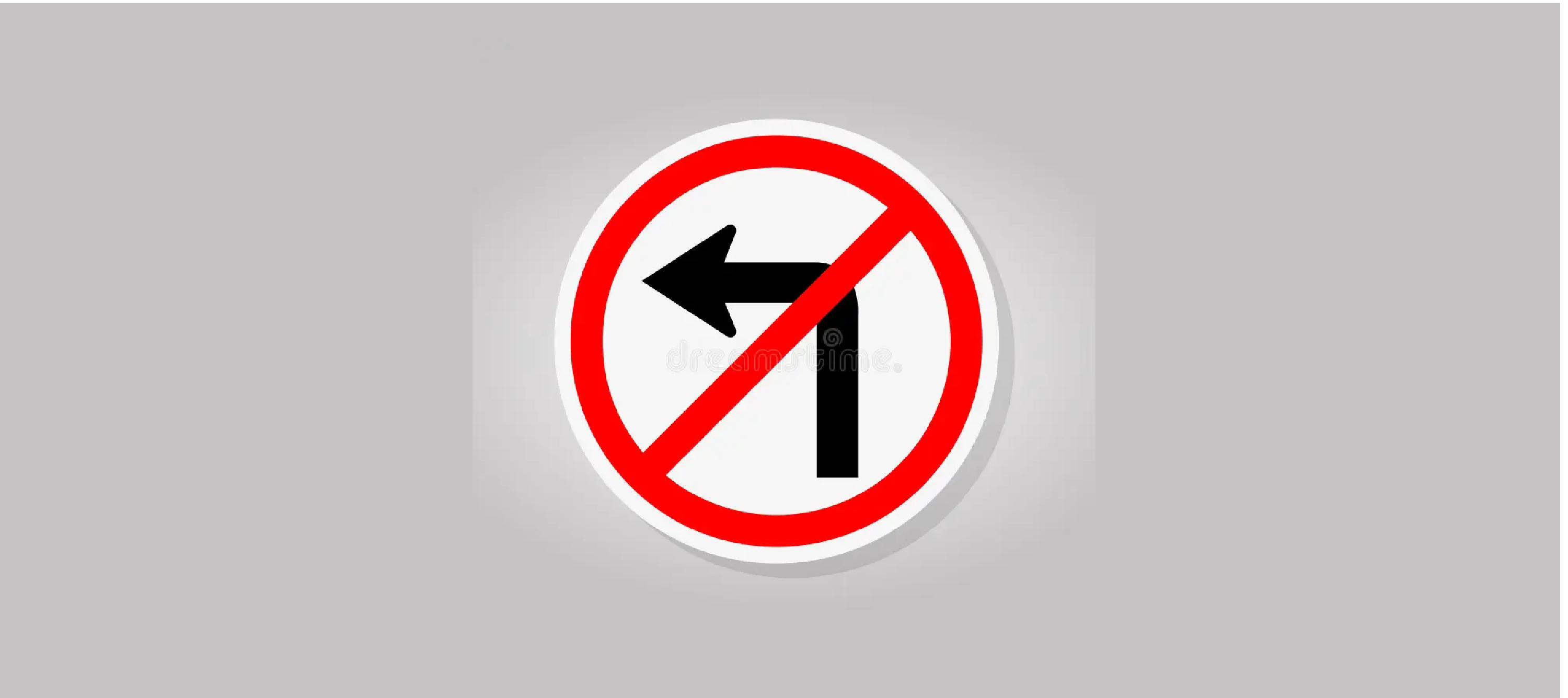
Road signs are meant to guide drivers clearly, but one highway sign instructed drivers to “Turn Left at Next Wrong Turn.” The phrasing was so baffling that it went viral online, leaving everyone wondering whether the graphic designer was trying to play a practical joke. Drivers needed clarity—not a cryptic puzzle—while on the road.
30. “Best Teachers Have Big Harts” Mug
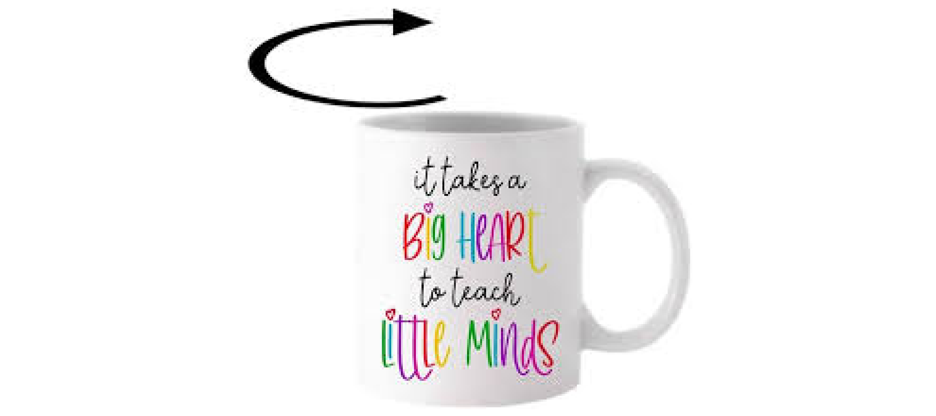
In an attempt to honor teachers, a company produced mugs with the message, “The Best Teachers Have Big Harts.” Unfortunately, the misspelling of “hearts” completely undermined the sentiment, and what was supposed to be a heartfelt gift turned into an embarrassing product failure.
31. The Skittles Twitter Fail
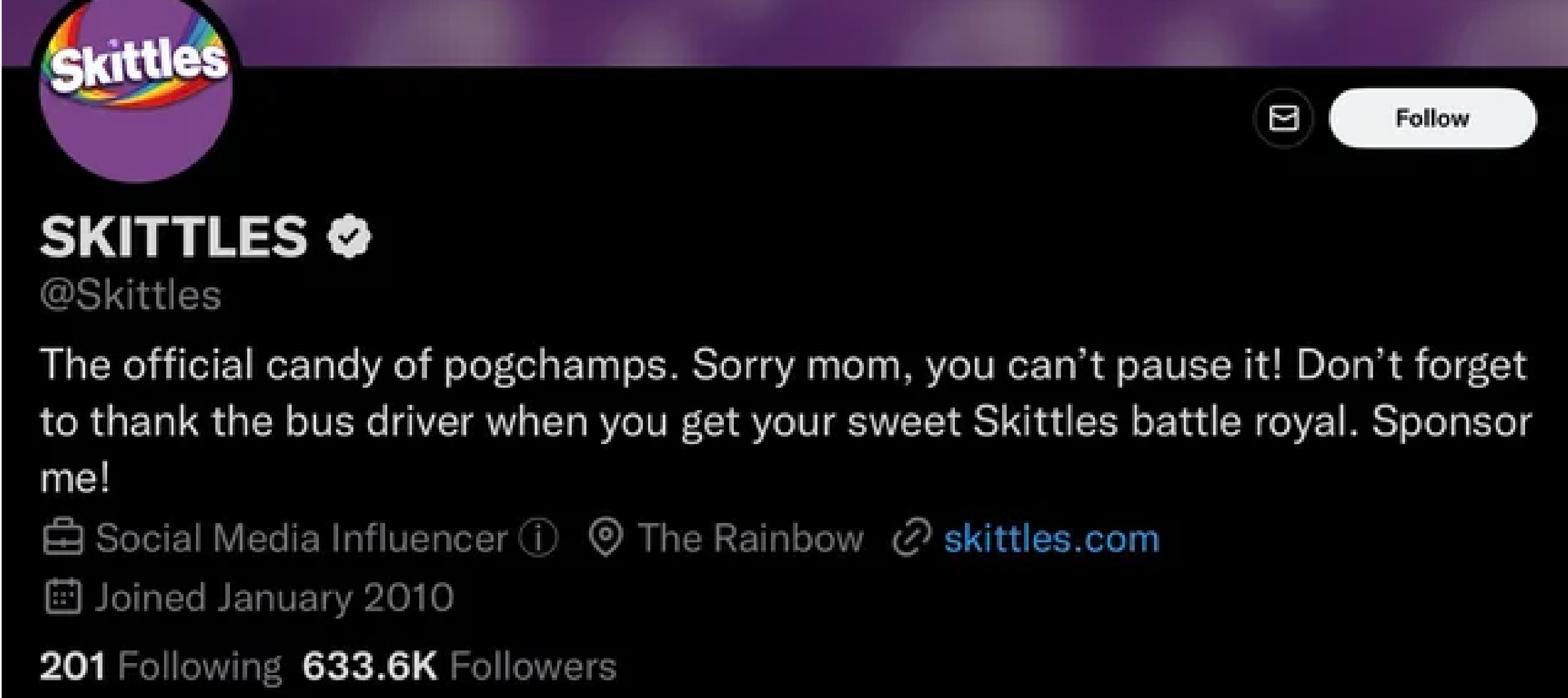
When Skittles launched a new social media campaign, they displayed user-generated content live on their website. This seemed like a fun, interactive idea—until people started posting inappropriate comments, which were broadcast for all to see. Skittles quickly learned that unfiltered user input can lead to PR disasters, even when it’s done with the best of intentions.
32. The Crocs & KFC Collaboration Disaster

Crocs teamed up with KFC to release limited-edition chicken-scented shoes. Yes, you read that right. The shoes were designed to look like fried chicken and even came with a “chicken” charm that smelled like the real thing. While the idea was meant to be playful, many found the design repulsive, and the collaboration quickly became a laughingstock online.
33. Coors Light’s Accidental Suggestion to “Drink Urine”
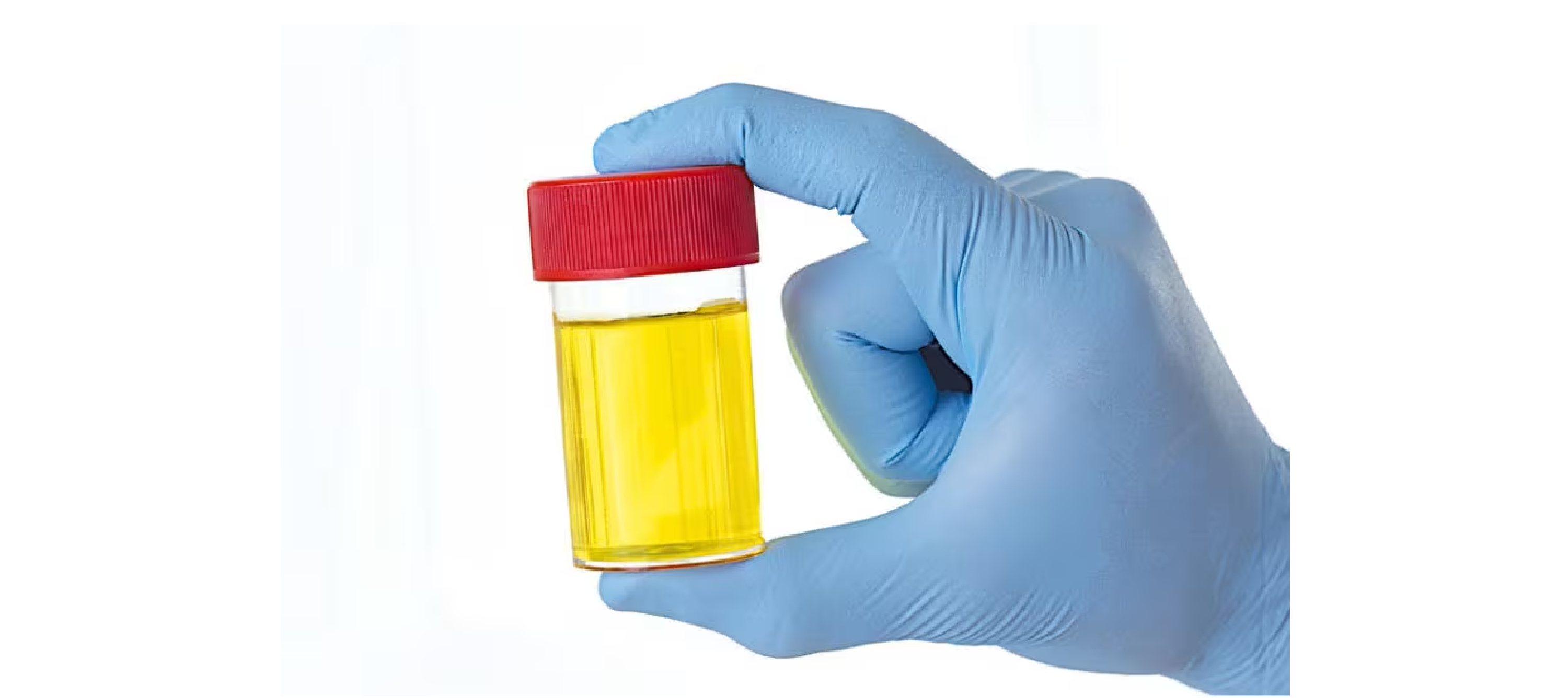
Coors Light once ran a campaign featuring temperature-activated cans that turned blue when cold. However, in a poorly translated advertisement for the Mexican market, the tagline “Turn It Blue” was mistranslated as “Drink Urine.” This translation failure became the butt of many jokes, teaching the brand a valuable lesson in cross-language marketing.
34. The Infamous Air Asia “Get Off in Thailand” Billboard
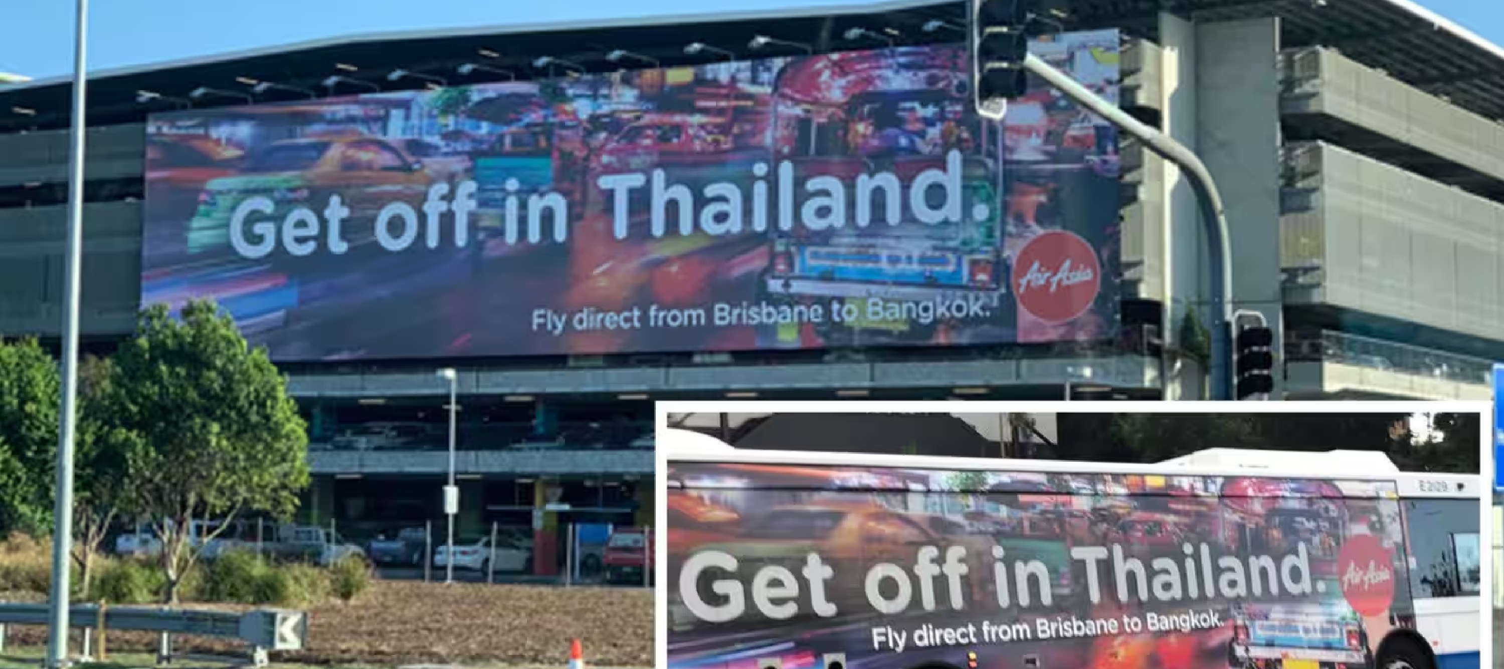
Air Asia ran a promotional billboard with the message “Get Off in Thailand” to attract tourists. Unfortunately, the phrase can also carry a sexual connotation, causing quite a stir online. Air Asia’s attempt at being fun and casual backfired, and they had to pull the ad soon after.
35. The “Nut & Honey” Packaging Fail
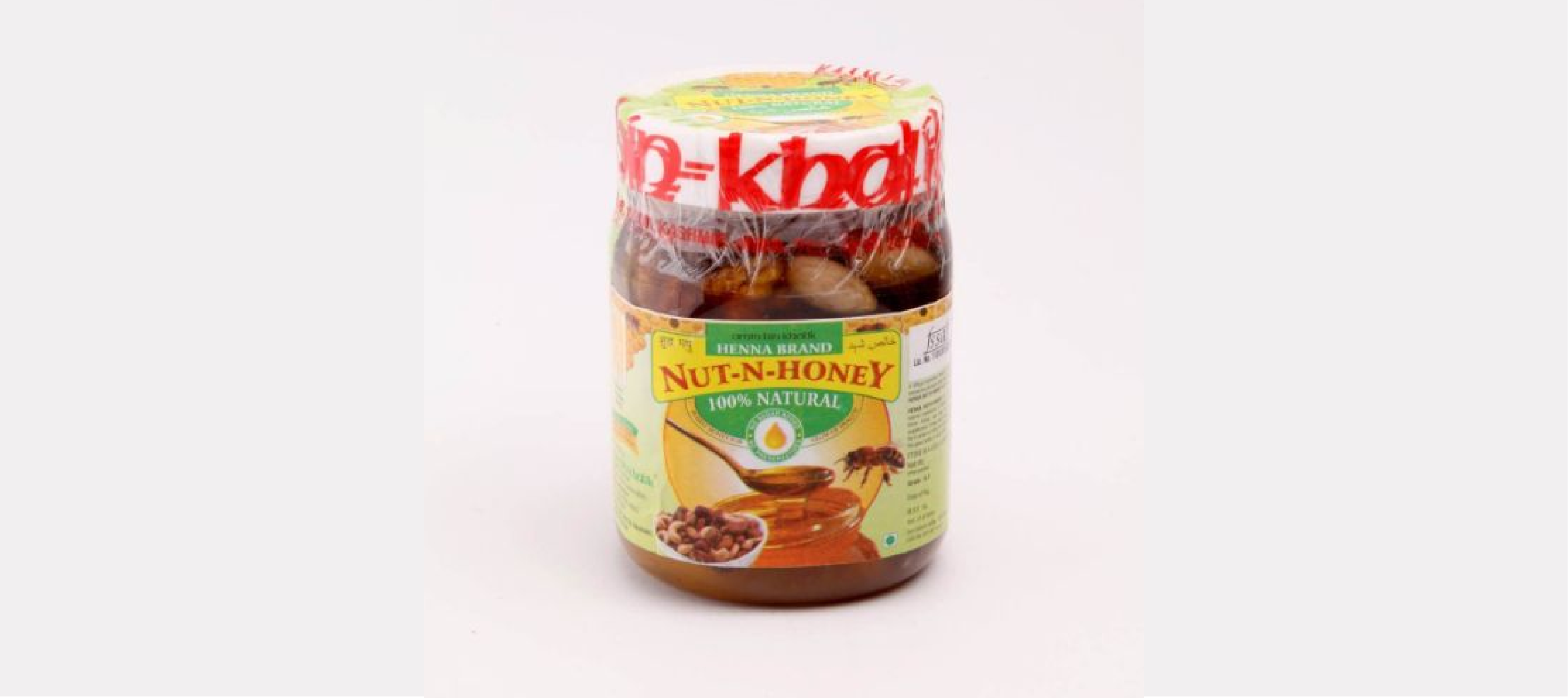
A breakfast cereal brand designed a box with the tagline “Nut & Honey,” a fun pun when spoken aloud. However, the text placement made it look like “Nut & H.” Consumers quickly pointed out how this unintentional abbreviation took on a vulgar meaning, turning a wholesome breakfast into a source of endless memes.
36. “No Entry” Door Design Fail

Many stores have “push” or “pull” signs on doors to help direct customers. One store, however, designed a door with a big “No Entry” sign but included a handle, leaving customers utterly confused about whether they were supposed to enter or not. This lack of clarity led to hilarious encounters where people attempted to use the door the wrong way.
37. “Lost” Cat Poster with a Dog Photo
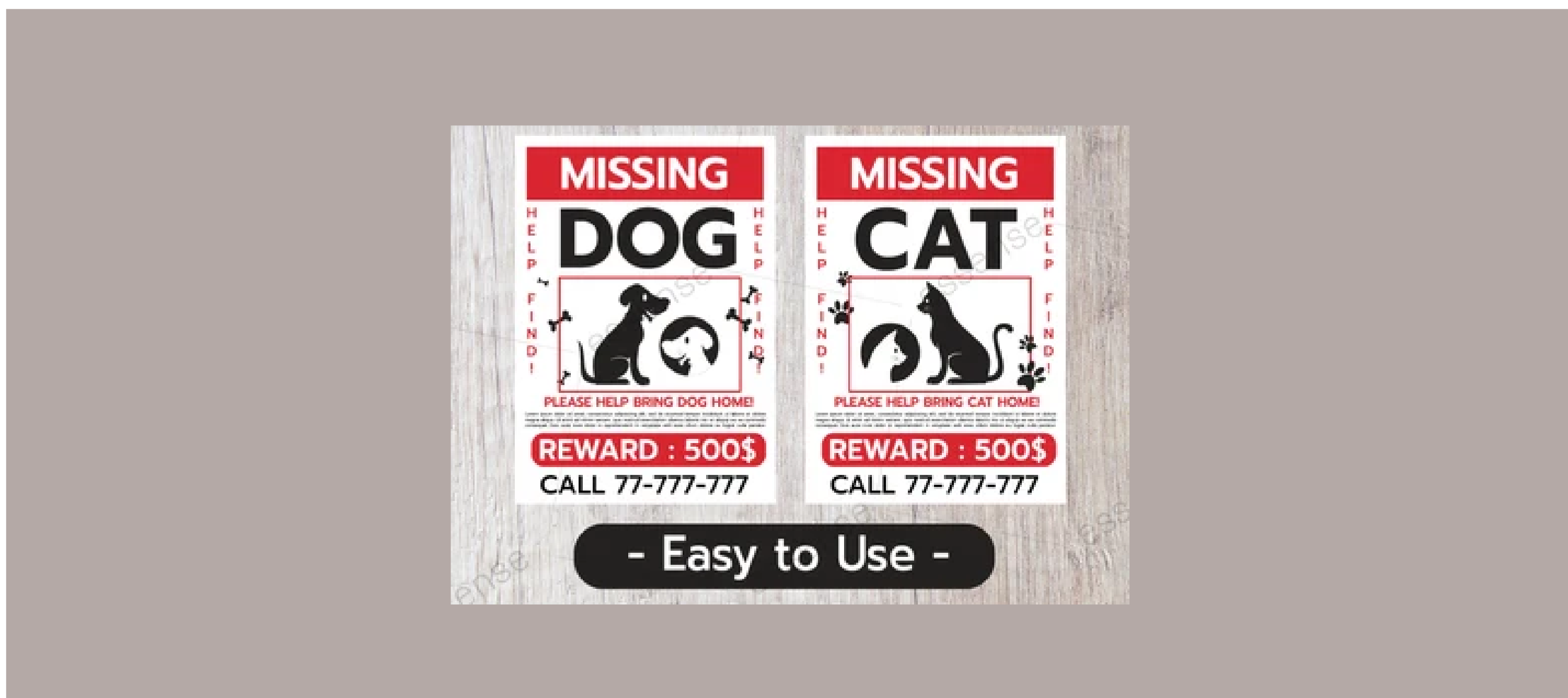
In a classic example of not checking your work, a “Lost Cat” poster once featured a picture of a dog instead of a cat. The oversight quickly turned the poster into a viral sensation, with the internet wondering if the graphic designer even knew the difference between the two animals. It’s a funny but costly mistake for anyone genuinely looking for a lost pet.
38. Reebok’s “Cheat on Your Girlfriend” Ad
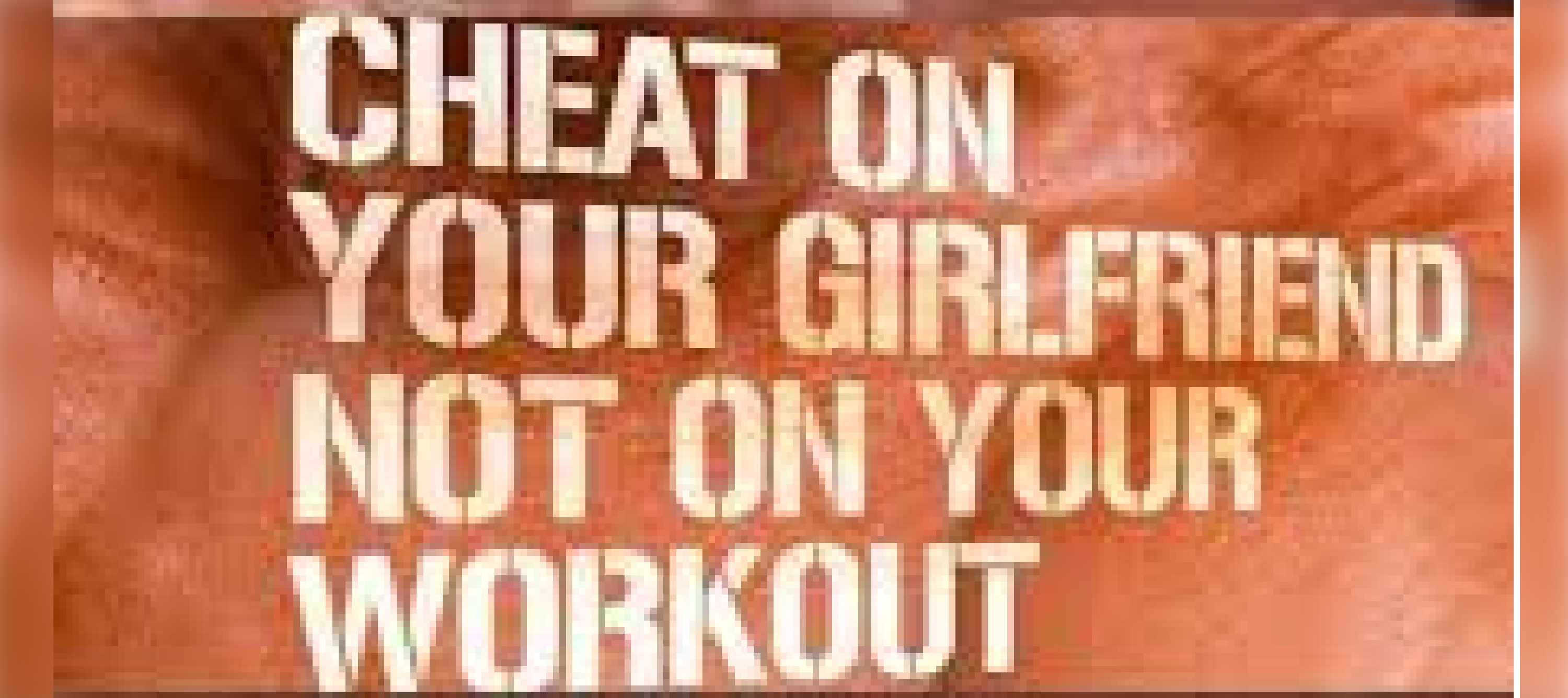
Reebok once launched an ad campaign with the tagline, “Cheat on Your Girlfriend, Not Your Workout.” What they likely intended as an edgy and motivating line turned into a PR nightmare, with many calling the slogan distasteful and offensive. Reebok eventually apologized and pulled the campaign after receiving backlash.
39. The H&M “Coolest Monkey in the Jungle” Scandal
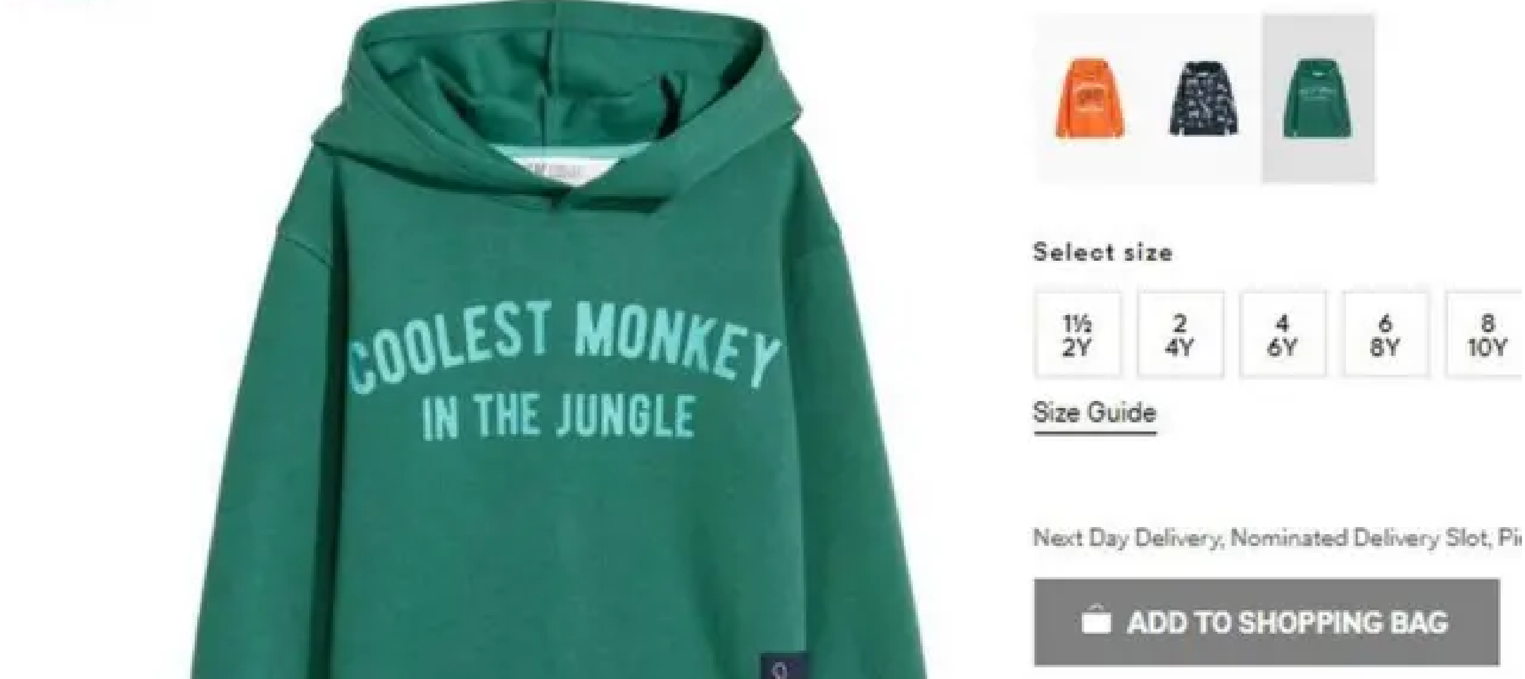
H&M came under fire when they released a children’s hoodie with the slogan “Coolest Monkey in the Jungle.” The problem? The hoodie was modeled by a young Black boy, leading to accusations of racism. H&M quickly apologized and withdrew the product, but the damage to their reputation lingered for months.
40. Coca-Cola’s “New Coke” Disaster
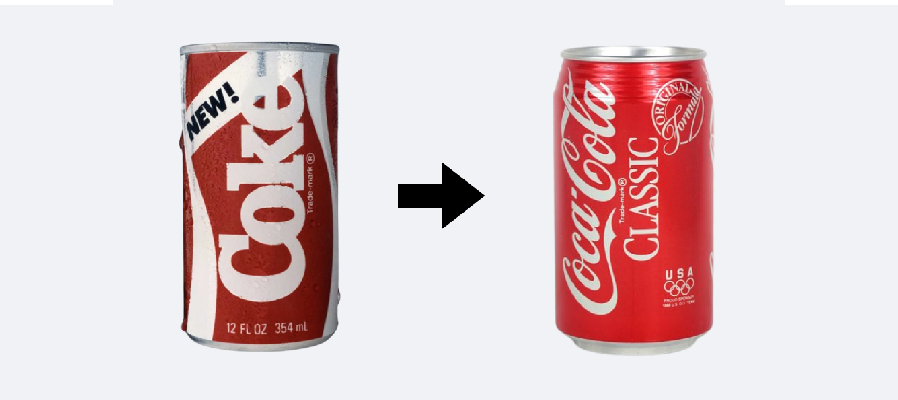
Coca-Cola’s 1985 decision to introduce “New Coke” is still considered one of the biggest branding fails in history. Despite extensive market research, the new formula was met with widespread public outrage, leading Coca-Cola to quickly revert to the original recipe. Sometimes, trying to fix what isn’t broken can lead to massive brand backlash.
41. KitKat’s QR Code Misfire

KitKat introduced a clever QR code on its wrappers, allowing customers to scan and instantly access their marketing campaigns. However, in one printing run, the QR code was misaligned, directing users to error pages instead. KitKat missed an opportunity to engage customers, and instead, the failure led to frustration.
42. Weight Watchers “WW” Rebrand
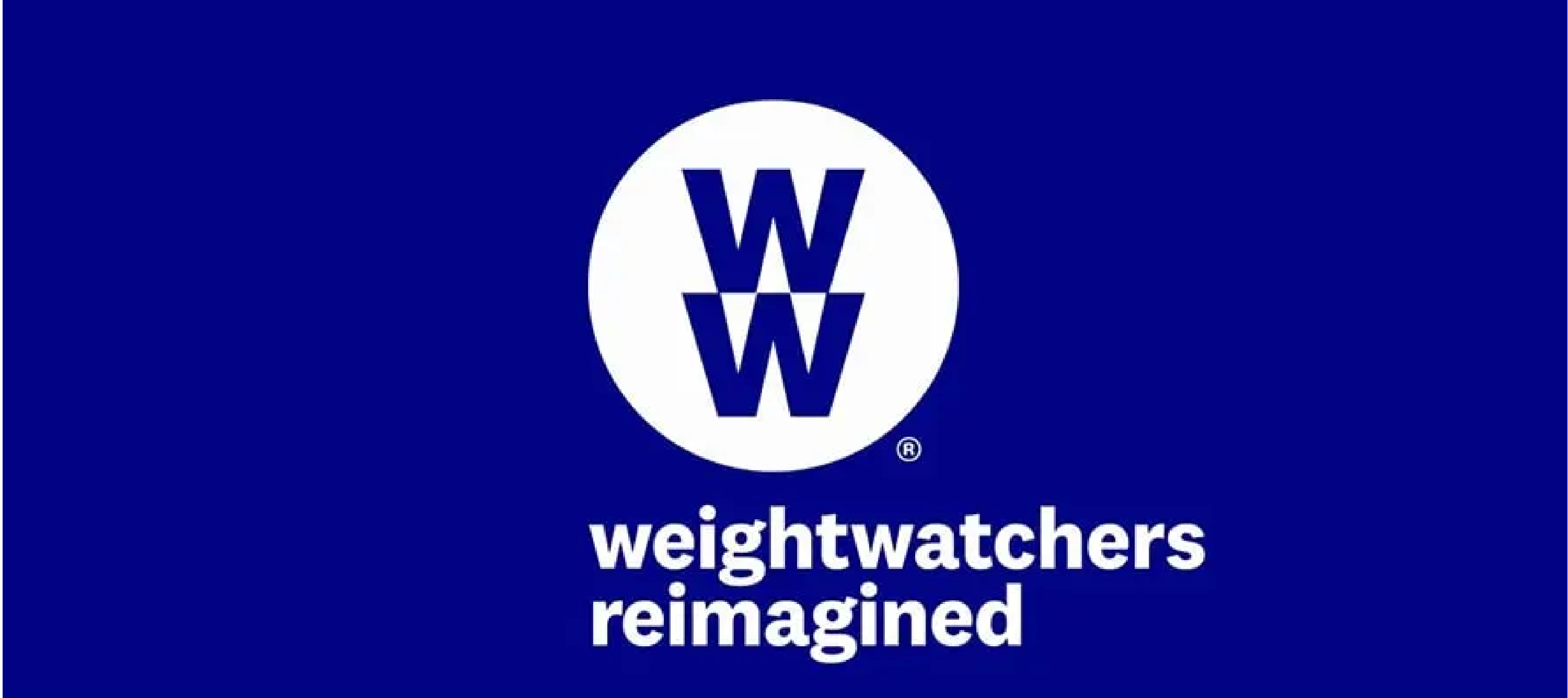
Weight Watchers rebranded as “WW” to focus on wellness instead of weight loss. However, the transition confused many customers, with some associating the initials with websites like Wikipedia or World War II. The unclear messaging and timing led to mixed responses, showing that a simple rebrand isn’t always the solution to a company’s problems.
43. McDonald’s “Try Our New Anus Burger” Typo
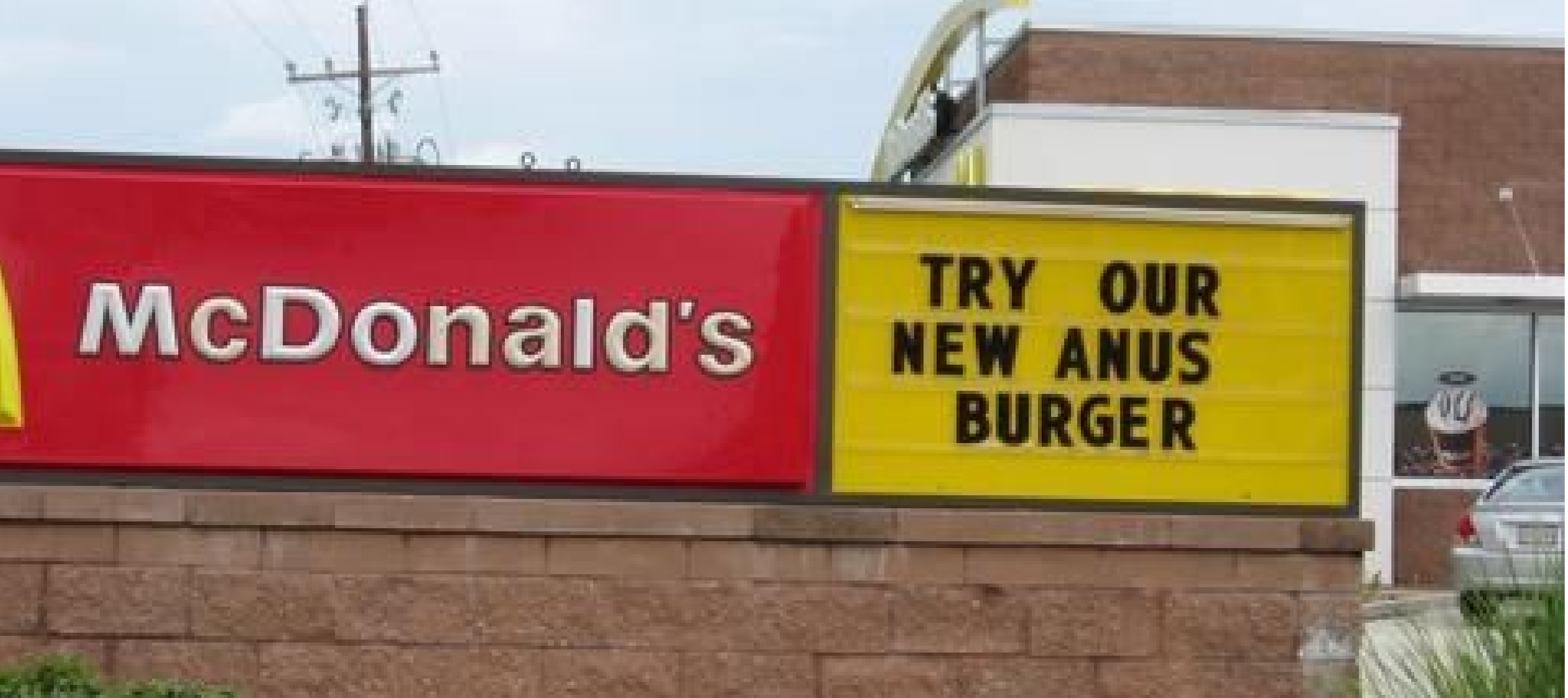
A McDonald’s sign intended to promote their new “Angus Burger” included a rather unfortunate typo, resulting in the phrase “Try Our New Anus Burger.” The sign became a viral sensation, and while the error was quickly fixed, it remains one of the most memorable fast food fails in history.
How INKLUSIVE Can Help You Avoid Design Fails
At INKLUSIVE, we understand that even a small design mistake can have big consequences, from damaging your brand’s image to losing customer trust. That’s why we approach each design project with laser-sharp precision, ensuring that every detail is spot-on. Our team of expert graphic designers excels in turning your ideas into visually captivating and professional designs that align perfectly with your brand’s identity and goals.
From typography and color schemes to logo designs, we leave nothing to chance. Our process combines beauty with functionality, ensuring your designs not only look fantastic but also convey your message effectively. We focus on avoiding those costly mistakes that can impact your credibility and brand reputation.
Whether you’re launching a new campaign, refreshing your visual content, or embarking on a complete rebrand, INKLUSIVE is your go-to partner for achieving flawless design. We offer comprehensive, end-to-end creative services—tailored to your needs—from concept to final execution. You can rest assured knowing that your designs will stand out for all the right reasons.
Packages & Pricing
We also understand that every business has different needs, which is why we’ve developed flexible pricing to suit you:
INKLUSIVE Starter Pack: For just $199, you get a 5-hour design package perfect for small, one-time projects or quick fixes. This limited-time offer is a great way to experience our design expertise without long-term commitments.
Looking for ongoing support? Check out our other subscription packages, designed to provide you with continuous creative power for all your design projects.
Don’t risk design fails—partner with INKLUSIVE today and let us help you deliver top-tier, mistake-free designs. Ready to elevate your brand? Contact us now and start creating with confidence!
Flawless Design Starts with INKLUSIVE
Avoid costly design mistakes with expert help. Try our $199 Starter Pack today!

Final Thoughts
Design is a crucial part of your brand’s success, and as we’ve seen from some memorable fails, even the smallest mistake can have a huge impact. Partnering with the right design agency helps ensure that your brand communicates effectively, looks polished, and stays far away from embarrassing mistakes.
Choosing professional graphic design services like INKLUSIVE means choosing precision, creativity, and reliability. Don’t let design fail to define your brand—work with experts who care about every detail.
Get started with INKLUSIVE today and let us help you build a brand that shines.
FAQs
What are some common typography design failures?
It typically includes bad font choices, issues in pairing fonts, poor kerning (letter spacing), and improper font sizes. These mistakes can make text difficult to read and damage the overall aesthetic of your design. Such typography issues can confuse users, decrease engagement, and harm brand credibility.
Can funny design fails impact a brand’s reputation?
Yes, funny design fails may go viral and bring attention to your brand, but often for the wrong reasons. While they may generate some laughs, they usually harm the brand’s professionalism and make customers question the reliability of its products or services.
How does graphic design fail to affect customer engagement?
Graphic design fails, such as cluttered layouts, mismatched colors, or poorly chosen images, can lead to confusion and frustration. Bad design reduces the user’s ability to engage with your content effectively, which can result in a loss of customers and missed business opportunities.
Why is choosing the right graphic design services important?
Selecting professional graphic design services ensures that your visuals are both appealing and functional. A skilled design team avoids common graphic design fails, producing high-quality work that enhances user experience, boosts engagement, and maintains brand consistency.
What are some bad typography examples I should avoid?
These examples include using overly decorative fonts for body text, poor contrast between text and background, and inconsistent font sizes. These issues make reading difficult and create a negative user experience, ultimately reducing the effectiveness of your design.
How can funny typography mistakes happen in professional design?
Funny typography mistakes often occur when designers don’t pay close attention to letter spacing (kerning), pairing font, or readability. These errors can unintentionally change the meaning of the text or make it difficult for readers to understand the message, leading to viral fails.
How can I avoid graphic design fails and funny design fails in my projects?
To avoid graphic design failure, invest in professional graphic design services. Working with a skilled agency ensures that your designs are polished and effective. A professional team will consider typography, color balance, layout, and user experience to create visually appealing and functional designs.